Hey! It looks like you're new here. You might want to check out the introduction.
Show rules for this event
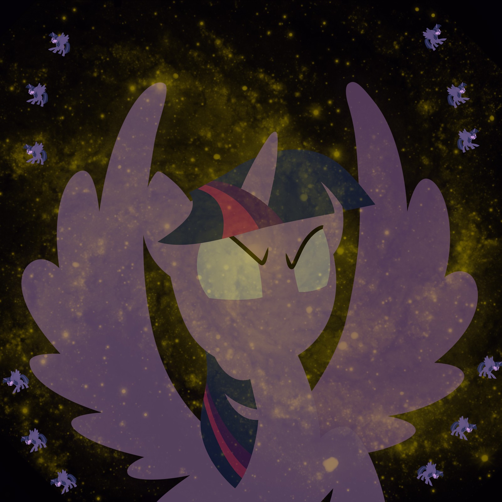
I love the little angry Twilights, it's a nice touch. Overall, this is very simple, but it works. The only thing I'd change would be the colour of the galaxy, perhaps a few additional shades of yellow would give the picture some depth.
Also, and this is entirely a matter of different ideas, I would've liked to see Twilight fade into the background of space, similar to how Eternity is portrayed in the Marvel Comics.
But, hey, this is still a very eye-catching image.
Also, and this is entirely a matter of different ideas, I would've liked to see Twilight fade into the background of space, similar to how Eternity is portrayed in the Marvel Comics.
But, hey, this is still a very eye-catching image.
The little Twis are a bit too small to make out. Varying their size could help. Apart from this, I appreciate the Buck-Yeah-Equinity spirit. Upper tier.
Pretty much like the others. I like the angry Twilight in the middle, but I think I would have prefered if the small Twilights were of different sizes, in different postures etc.
Also, I don't know what to do with the caption. Is that shameless promotion? Referencing a well-known deviantart artist? Something completely different?
Whatever it is, the whole picture did leave a good impression on me. The little Twis are details, the main intention being well rendered with the angry Twilight in the middle, on her way to prove Celestia wrong.
>>Fenton
I couldn't say for certain, but I believe those links in the caption may be the source of the vectors used.
I couldn't say for certain, but I believe those links in the caption may be the source of the vectors used.
Good on you for sourcing your vectors, artist (cf: >>Zaid Val'Roa >>Fenton). (For the record, the links in the caption go here and here.) I see what you're going for, but that idea of an army of cosmic Twilights reshaping the universe is a little hard to communicate with that single halo of same-sized figures; it also felt odd to me that the big central one looks kinda indignant or upset rather than … man, I don't even know what I was expecting for someone undertaking a project of that magnitude, but anger isn't it. Maybe some sort of Bodhisattva-like peaceful transcendence?
So, yeah, not sold on the execution, but a worthy try. Thanks for submitting!
So, yeah, not sold on the execution, but a worthy try. Thanks for submitting!
