Hey! It looks like you're new here. You might want to check out the introduction.
Show rules for this event
First one to show up on my slate.
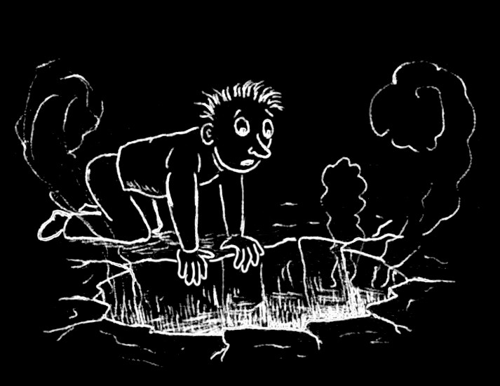
The character looks like Doug from the TV show. Don't know if it was done on purpose or not.
As for the style, it is simple but still very effective. I like that it's white on black, it gives a nice atmosphere related to the subject. Not very fond of the facial expression though, especially the eyes. Since it seems that you used tippex, I don't really know how you could avoid that.
However, Staring Into The Abyss was a couple months ago :p
Simple and pretty striking, I have to say that my only real issue is that I'm not sure that the sort of cartoony/iconic style for the person worked well with the theme of the piece. It is nicely drawn, though.
The character is rendered in a ‘toonier style than the pit. Had the artist shown the pit illuminating the character, that would have helped the atmosphere of the piece. These issues aside, this is direct and effective, and the detailing of the pit is well executed. I like it overall.
I suspect this was drawn black-on-white (unless someone's a fan of scratch art), and I think inverting the colors was an excellent choice. It really evokes the lighting coming from the pit in an otherwise hard-to-replicate way. Part of me wants more of a background, and part insists that the lack of background is perfect for the "guy in darkness staring at a lit hole" effect.
This is cartoony but cleanly done on the whole; it feels a little like nitpicking to note that the three different steam clouds are all rendered in different ways, but that's a distraction as I try to really focus on the composition as a whole. Equally nitpicky, kudos for the five-fingered hands (though you're probably discovering why many cartoonists do them as four).
This is cartoony but cleanly done on the whole; it feels a little like nitpicking to note that the three different steam clouds are all rendered in different ways, but that's a distraction as I try to really focus on the composition as a whole. Equally nitpicky, kudos for the five-fingered hands (though you're probably discovering why many cartoonists do them as four).
>>horizon is right about this being drawn black-on-white first, and then inverted. This also means that the radiance down in the pit was originally supposed to be shadows, until I realized the image looked much better white-on-black.
If you look closely you might realize that the guy's hands were drawn on a computer with the brush tool; the way I originally drew them on paper, his fingers were splayed apart, suggesting that there was a transparent pane on the pit (and potentially confusing the viewer about whether that's a pit or a giant fat caterpillar.)
The image originally contained a few more details (there was a question mark next to the guy's head, as well as a thought-bubble where he was imagining a devil down in the pit), but I got rid of them because they looked kinda lame and detracted from the atmosphere.
