Hey! It looks like you're new here. You might want to check out the introduction.
Show rules for this event
That's where the question of what is the difference between writing and drawing blur.
For me, it isn't as important as what I can get from it, and what I got from this isn't very big. It's funny and a bit sad and what will follow that send is very obvious but it didn't do much else.
So, sorry but it won't score very high for me.
For me, it isn't as important as what I can get from it, and what I got from this isn't very big. It's funny and a bit sad and what will follow that send is very obvious but it didn't do much else.
So, sorry but it won't score very high for me.
TD and Fenton up there said it pretty well... screenshotty and writing. Sure, it provides a momentary laugh, but nothing substantial.
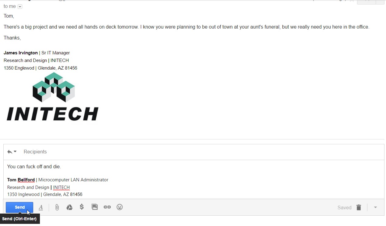
Well, this one's a bit of an implication sledgehammer rather than an implication rapier. It's got what it needs to get its point across with that F-bomb punchline. Honestly, though, I feel like there's so much more context I want to see: what's got Tom so riled up that he can overreact so viciously?
And in a way, that feels like this piece's weakness. It leaves a lot unexplained around the edges (that writers can step up and try to fill in, but that this as a standalone art piece feels oddly empty without) ... but it's blocking in so much of the core story arc with that specific setup and the e-mail reply that I'm finding it hard to draw much inspiration from it. Though I note that the mouse pointer is merely hovering over send, which is a nice touch.
Artistically and compositionally ... what can I say? It's very effective in emulating the screenshot. It's, well, a screenshot. I can't really evaluate it aesthetically so much as judge the effort of its assembly and its effectiveness in communicating its ideas. ¯\_(ツ)_/¯
Thank you for sharing!
