Hey! It looks like you're new here. You might want to check out the introduction.
Show rules for this event
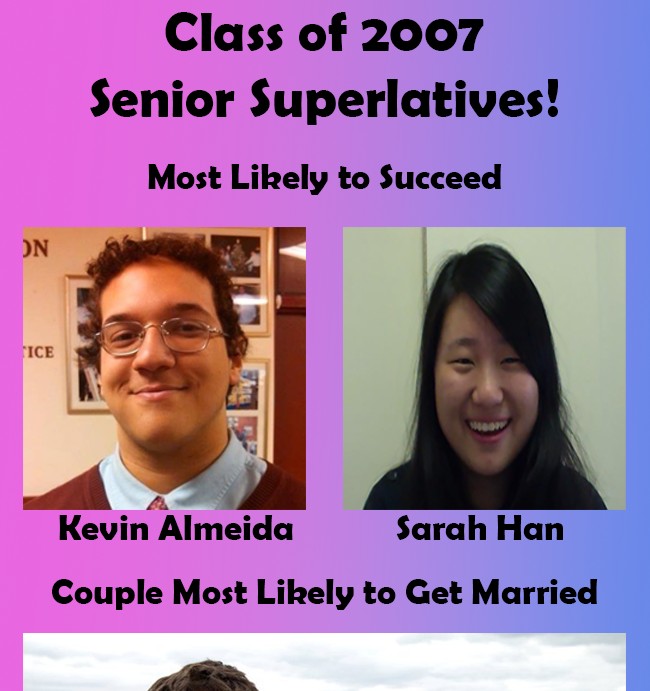
This is even uglier than most yearbooks! While I appreciate the attempt to emulate the badness of yearbooks, this doesn't quite look right; it looks too shopped and clean. I think giving this some glossy sheen, as if it was a picture or scan of a yearbook page, might have helped.
>>MLPmatthewl419
The individuals in the picture had high expectations placed on them early in their life, and there is a heavy implication that they failed to "succeed" — thus having the most humiliating failure out of everyone in their class. They had the farthest to fall.
This gets across its tale of the prompt effectively (to me, at least), but I don't know how much there is to artistically evaluate. I definitely appreciate that it provided the additional context of the next entry down — in that way, it's something of a study in minimalism; it provided exactly enough information to communicate its context, which is a praiseworthy skill. But no yearbook I've ever seen used such a gaudy solid-color gradient (maybe I was lucky?), and I agree with >>TitaniumDragon that taking this pic more deliberately lo-fi to sell the "scanned page" aesthetic would have helped a great deal. Perhaps grayscale with a halftone dotting effect? Compositionally, the gradient is also sucking up so much of my attention that it's making it harder to get the point across.
This is essentially just a random picture of two people. It has no concept to speak of, isn't even aesthetically pleasing, and there is no obvious connection to the prompt.
>>JudgeDeadd
I don't normally do this, but the prompt connection here is actually hella obvious.
Voted most likely to succeed in graduating high school. That's a pretty easy pedestal to come crashing down from.
I don't normally do this, but the prompt connection here is actually hella obvious.
Voted most likely to succeed in graduating high school. That's a pretty easy pedestal to come crashing down from.
I hope these aren't real names... or else you might have a lawsuit coming your way, artist. :P
I'm surprised peeps are having trouble seeing the prompt here. As >>AndrewRogue noted, it was pretty obvious to me. In any case, this is garish as hell, but I sorta love it? I like the idea of trying to remake a yearbook. Not my favorite of the competition, but very interesting.
I'm surprised peeps are having trouble seeing the prompt here. As >>AndrewRogue noted, it was pretty obvious to me. In any case, this is garish as hell, but I sorta love it? I like the idea of trying to remake a yearbook. Not my favorite of the competition, but very interesting.
>>Dubs_Rewatcher
Kek, I'm pretty sure he's in the clear.
else you might have a lawsuit coming your way, artist.
Kek, I'm pretty sure he's in the clear.
