Hey! It looks like you're new here. You might want to check out the introduction.
Show rules for this event
I like how someone -- Miller? -- said over the Discord chat that #silicon would get no art because it was too hard to illustrate. I like to think every single fucking artist in the Writeoff saw that and took it as a PERSONAL CHALLENGE because by far #silicon has had the most art.
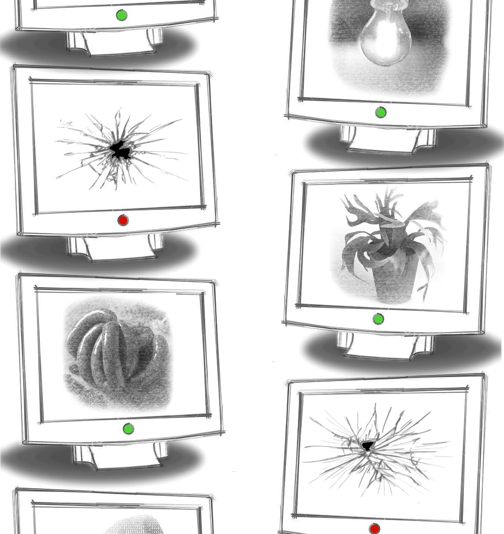
That aside -- I like this one! It's a rather literal interpretation of the story, no? A series of characters, and the only thing that differenciates them is how they talk and act, and the fact that they're all computers. So, a series of monitors with different pictures, and that's your cover art. Pretty damn representative of the story, really.
Not one to know a lot about art, sadly, so take these commens as coming from a novice -- but I like the composition of the piece? It's just two rows of identical monitors facing each other, but the detail of there being more off-camera that we don't see implies an infinite number of them.
It's pretty romantic! In a way the story isn't, actually. The story more plays with the whole who's human-who's machine dilemma, while this is pure machine, so it feels colder.
The shadows are a bit weird? There's shading on the ground but not on the screens themselves, and the perspective is kinda wonky too, because it's just the same monitor copypasted again and again.
But ultimately I think the piece works pretty well. It's kinda abstract in that I think it's not supposed to represent a literal row of monitors, but rather the idea of computers talking to each other -- this, I don't know, sense of futility to it all? In the end this doesn't matter, it's just monitors passing time and breaking each other. But they're not unique, aside from what is inside, and you can clearly just substitute one for the other on a whim.
It's a cold piece, in other words. Fits the story, though I do think it has a much more melancholic air than the story itself. That might be me reading too much into it? But, hey, I'm not an artist, so y'all have to do with me trying to interpret this as a story in purely visual form. That'll work.
Good job, author. I think this picture does a better job than the story itself at giving the story some emotional depth. Which is hard to do, when all you're looking at is a bunch of screens.
The concept of LCD screens as glass masks is one of the more fruitful ideas one can pull from the prompt. Artist, you get a minor downcheck for using the same monitor frame over and over, but I’ve been there before and done CRTL-V and flip many times and cannot comfortably chasten you. The caption is a nice tip to the story. I will rank this as a mid slater.
