Hey! It looks like you're new here. You might want to check out the introduction.
Show rules for this event
Okay, Rodger provided a solid explanation for this one, which I judged too quickly.
I'll just give the link he gave
http://portfoliolive.wpengine.netdna-cdn.com/wp-content/uploads/2011/06/bubble-phases-1024x686.jpg
I'll also add that if it is indeed related to it, that wasn't obvious for me at all, since I had never seen these graphs.
So I take back what I said about trolling.
The explanation I got will grant this a better rank but it won't be very high for me since I still stick to my first reaction in a way. This is a bit too vague and it lacks some context to properly embrace the different possibilities of interpretations.
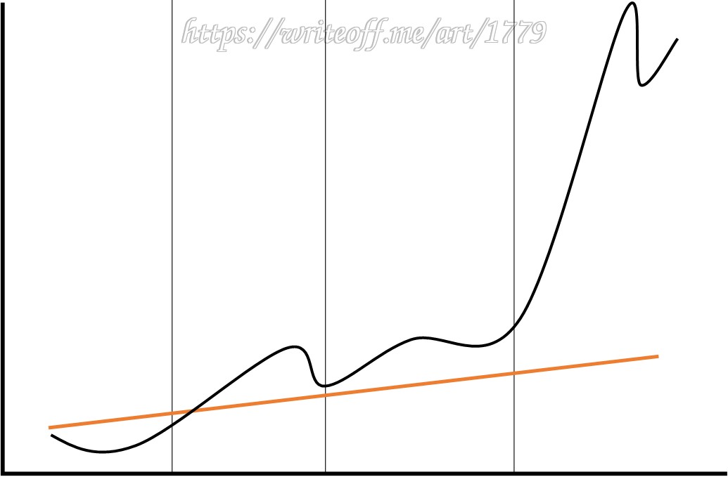
This looks like a graph of some sort, but typically speaking graphs are read left to right, so it doesn't quite give me the sense of going a long way down so much as being high up. I do get that this is trying to depict something like a bubble, but it doesn't quite come together for me for that - it is more suggestive than anything, and I think a lot of people aren't going to get what it is on about.
Still, I'm sure someone can make something out of this, if they are of a mind to do so.
Still, I'm sure someone can make something out of this, if they are of a mind to do so.
I also needed the link that >>Fenton mentions to understand this picture. It’s showing the run up that goeth before a fall.
There are many metrics by which one can judge art. With something as simple as a line graph, we mostly have to go by meaning, and this one’s meaning is only apparent (without further explanation) to those educated in finance/mathematics. So, as art, I consider this mostly a bust. As a prompt idea, it is workable. I’ll put this down as mid-tier.
There are many metrics by which one can judge art. With something as simple as a line graph, we mostly have to go by meaning, and this one’s meaning is only apparent (without further explanation) to those educated in finance/mathematics. So, as art, I consider this mostly a bust. As a prompt idea, it is workable. I’ll put this down as mid-tier.
Without that link that >>Fenton put in, this looks more like "Going Up" than "It's a Long Way Down." I am very glad I read the comments before judging it, so, you know, thanks, Fenton.
