Hey! It looks like you're new here. You might want to check out the introduction.
Show rules for this event


I unfortunately didn't read the story that comes with this, and the subject it represents doesn't help guessing what this all about (same goes for the caption). So thematically, I'm kinda out.
However, the lighting on the vase is gorgeous. The different shades of black and white are very well balanced and fit perfectly. I wish I could say more than "it's pretty". I'll try to read the story and come back with something else, but for now, I can already say that this one won a lot of points in my slate.
Thank you for your work.
… it's a day before the end of finals and there are art pieces with only one comment? Let's fix that, people!
Compositionally, I think this works surprisingly well for its simplicity. I have a sneaking suspicion the vase was put into greyscale in order to not have to deal with clashing colors between the muted vase tones and the pastel pony tones, but it also works as a look, especially with the shadowy surroundings. I'm of mixed feelings about the blobbish nature of the ponies in the top row; they work with the composition, but also break me out of the piece a little with their lack of detail. The windigos in the lower row, though, work very well, I think.
I wonder if maybe an Element of Harmony, or Twilight's six-pointed star, might have been similarly overlaid onto the geometric designs at the top?
Probably middle-tier for me but I like it as a piece.
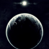
Clever idea, and skillfully done. I'm guessing that this is a composite with an actual amphora, in which case it was well done. Most of the pony images feel organic, particularly the bottom layer. The top images have a few issues; the rightmost ones feel like they're leaning a bit too far to the left, while the rightmost ones are standing up too straight. Regardless, it still comes off as an appealing whole. Thanks for sharing!
Gate was one of the most solid entries I've read in the writeoff in a while, and I needed to make something for it, so I decided to tackle the element which starts it all, the accursed amphora of... uh... Yeah, I've got nothing.
>>Fenton
Thanks! For an art round, I think visual appeal is high praise already. I'm glad you liked the lighting. The vase I used as a base was--as others have guessed--in colour, and more brightly lit. So I darkened it and painted over some of the edges and part of the front to get the effect of being lit in the shadows.
>>horizon
I'll admit that getting an even look between the amphora and the ponies and windigoes was my main reason for making everything black and white, but I was also aiming for an effect of mystery and foreboding by having the vase surrounded by darkness, with only its major details standing out as it reached the source of the light.
I think I sort of achieved what I wanted. The more I looked at it, the more I realised the top row of ponies could've used a bit more shading to better blend with the vase as a whole and, yes, I went overboard with the stylisation and ended up with blobby ponies.
As for what could've been included in the drawings on the amphora, well I just went with what the story mentioned:
Maybe I should've taken more liberties with it and created a more interesting composition. Still, I'm happy you liked it.
>>Caliaponia
Yeah, I fumbled with lots of pony vectors trying to get them in the appropriate position and shape they would be if seen on a three dimentional vase. A few let a lot to be desired, mainly the ones reaching the edges, as you mentioned.
Overall, I'm mostly satisfied with how this turned out, and I'm glad you liked it.
>>Fenton
Thanks! For an art round, I think visual appeal is high praise already. I'm glad you liked the lighting. The vase I used as a base was--as others have guessed--in colour, and more brightly lit. So I darkened it and painted over some of the edges and part of the front to get the effect of being lit in the shadows.
>>horizon
I'll admit that getting an even look between the amphora and the ponies and windigoes was my main reason for making everything black and white, but I was also aiming for an effect of mystery and foreboding by having the vase surrounded by darkness, with only its major details standing out as it reached the source of the light.
I think I sort of achieved what I wanted. The more I looked at it, the more I realised the top row of ponies could've used a bit more shading to better blend with the vase as a whole and, yes, I went overboard with the stylisation and ended up with blobby ponies.
As for what could've been included in the drawings on the amphora, well I just went with what the story mentioned:
crystal pony phalanxes aligned against windigoes, elaborately dressed courtiers presenting gifts to a monarch, a pale mare nursing a foal beneath a crystalberry tree
Maybe I should've taken more liberties with it and created a more interesting composition. Still, I'm happy you liked it.
>>Caliaponia
Yeah, I fumbled with lots of pony vectors trying to get them in the appropriate position and shape they would be if seen on a three dimentional vase. A few let a lot to be desired, mainly the ones reaching the edges, as you mentioned.
Overall, I'm mostly satisfied with how this turned out, and I'm glad you liked it.