Hey! It looks like you're new here. You might want to check out the introduction.
Show rules for this event
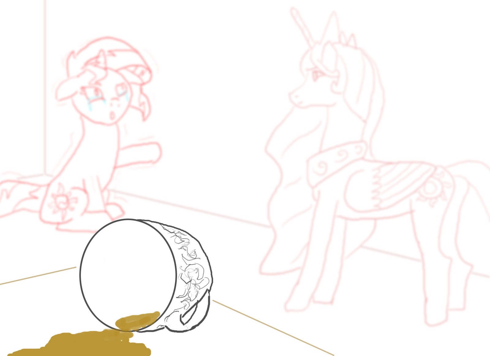
Those are some short legs on Sunset. I can't say if you purposefully blurred them due to that, but the focus on the spilled drink is a nice touch.
Another art piece with only one review. Let's spread around some love. Also, >>RogerDodger, is it possible to add comment statistics in on the Art Gallery page the same way as on the Fic Gallery, in order to make it easier to realize when feedback is spread unevenly? (Maybe just put something like: [💬5 👤3] after the piece's title?)
Like Zaid, I could talk about the flaws in the pony proportions (though Celestia's hind legs and Sunset's neck stand out to me more than Sunset's legs), but presumably with your apology in the caption you're already feeling the pinch there. What I do like is the balance of the composition, and the focus blur putting the emphasis on the spilled tea as a stand-in for the stand-off in the background. The choice of colors sort of half-works; Celestia looks a little washed out, but Sunset's faded dark pink is excellent as a complement to her out-of-focus-ness. Consider making Celestia more pink, maybe? Or using some subtle accents for her mane?
I like the emotion in Sunset, and the contrast of emotions, though I'm not 100% sure it works in concert with the source. I guess the tea spilling is that point in the story when Sunset freaks out over the tea being poisoned? But I don't see anything about spilled tea explicitly in the text, and if that were to happen, my mental image of that scene would be something like it dropping to the floor as Celestia lunged in for the hug.
Still, thanks for submitting! A valiant effort against the time crunch!
This picture is well composed, and the cup is particularly well done - both in what it adds to the composition, but also in the perspective and foreshortening the decorative design on it.
I'm not reading much from Celestia, but Sunset is emotive. Both are reasonably well done; not quite as clean as the cup, but they're also more complex subjects.
Of course the elephant in the room is that this is a sketch, and has trouble stacking up on fully fleshed out pieces.
Overall, it seems like a solid foundation for a piece. I'm guessing that the artist may have run out of time, in which case, I hope they will manage to complete it.
