Hey! It looks like you're new here. You might want to check out the introduction.
Show rules for this event
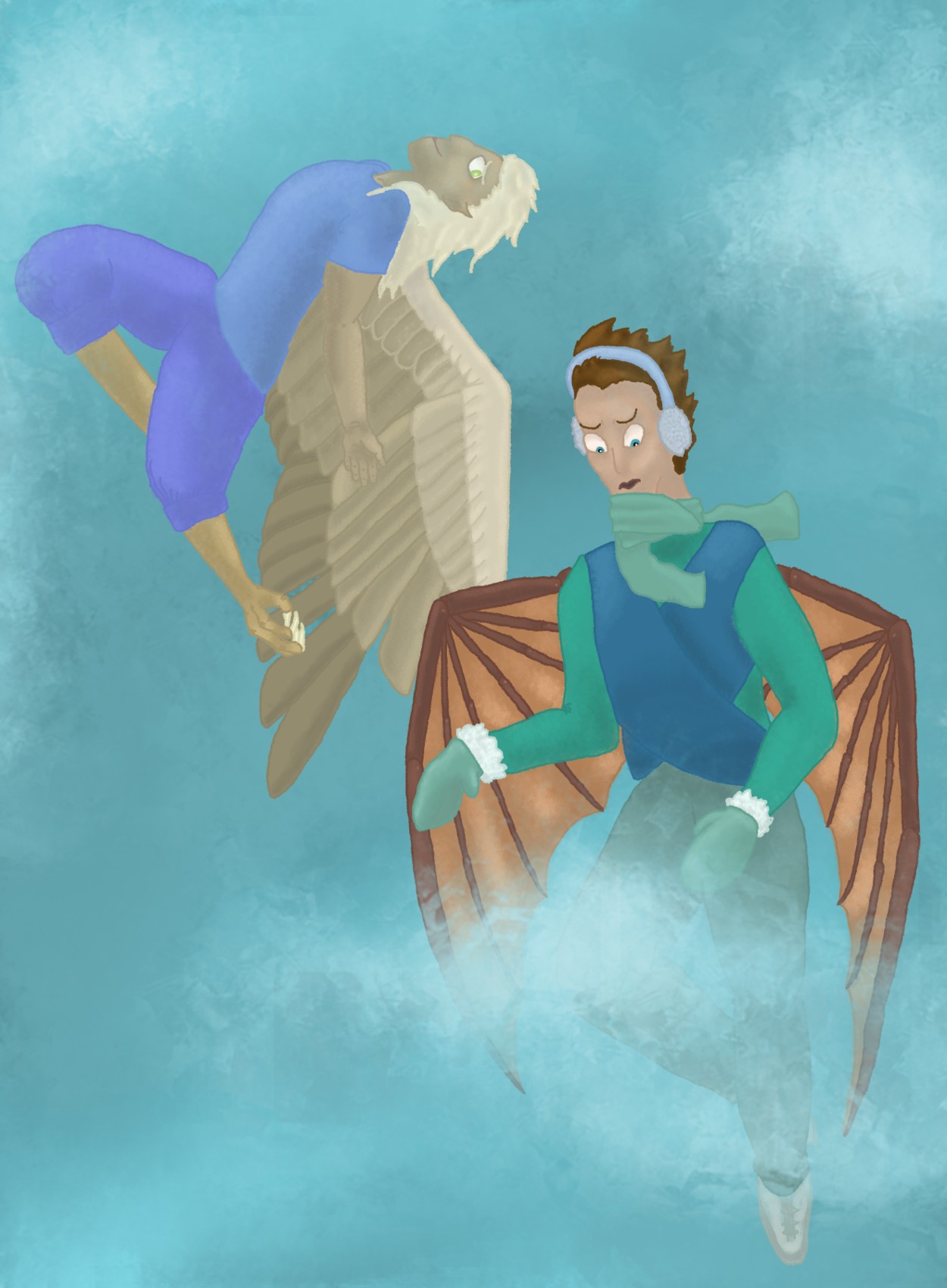
Should one be up in the clouds on a first flight?
I didn’t see that the figure on the left had an arm at first. The contrast can be improved here. I think the piece overall could use more definition and clarity in the rendering. The eyebrows in particular look cartoony in comparison to the rest of the piece. The anatomy of the figures needs some attention (compare the claw legs of the figure on the left, for instance).
On the plus side, Artist, you’ve presented a charming otherworldly scene and it looks as if you rendered it in traditional media, an extra challenge under Writeoff constraints. I like this piece and consider it to be a strong entry for this round.
Huh. How has this only accumulated one comment so far?
Agreed that the linework isn't contributing as much to your clarity as it could. Artist, you might want to consider doing lines in black and then making a separate layer underneath for coloring so that your edges remain crisp and bold. In some areas (the harpy's wings, the draconic (mechanical?) wings) the technique you're using looks good, but the harpy's wing/arm contrast is poor and the areas where widely different colors butt up against each other look a little mushy.
A lot of effort has gone into shading here, to mixed effect; great in (say) the right-hand guy's cheekbones, but the shading in (say) the harpy's face looks quite odd to me since it doesn't match the rest of the picture in suggesting the light comes from above the figures.
I love the way you bundled the guy on the right up for winter. (I keep wanting to call him a dragon, but I'm pretty sure that the wings are segmented and have pins holding the joints together.) I do wish that the composition had been such that you could have put the cloud elsewhere; losing the lower half of the right-hand figure feels like it throws the composition a little out of balance.
On balance, though, this is good non-verbal storytelling.
