Hey! It looks like you're new here. You might want to check out the introduction.
Show rules for this event
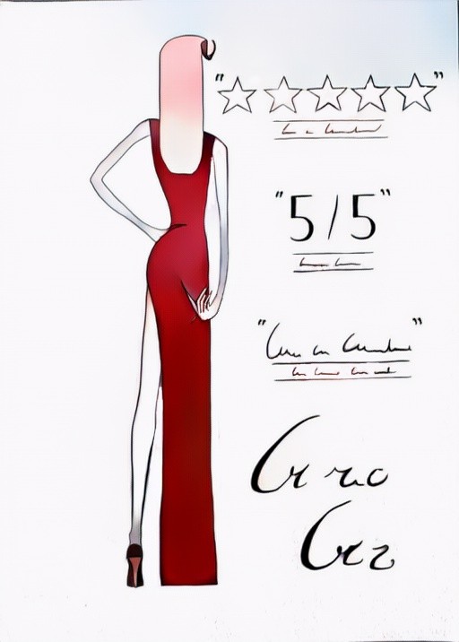

There isn't a good size for legs. The good size is when your feet touch the ground.
Don't know if the five stars and the 5/5 are supposed to rate the size of her legs or dat ass. And is it me or is she actually scratching her a-hole?
Anyway, nice drawing, even though I can't really decide what does this could mean, it is certainly open to interpretation.
Don't know if the five stars and the 5/5 are supposed to rate the size of her legs or dat ass. And is it me or is she actually scratching her a-hole?
Anyway, nice drawing, even though I can't really decide what does this could mean, it is certainly open to interpretation.
For some reason, I can't help but think of Thoth looking at this.
Looks like some sort of ad for a movie or something similar. Vague enough to let people play with it.
Looks like some sort of ad for a movie or something similar. Vague enough to let people play with it.
Oh, wow. The style absolutely pops off the page with this one. The linework and exaggeratedly willowy shape of the character reminds me very strongly of a particular artist I can't name but have seen in high society cartoons (New Yorker?). The shading is subtle and laser-targeted to where it does the most good; the light blue wash around the stars up top is especially nice. The movie-poster formatting is super on-point, the typography is bloody fantastic for hand-drawn, and the Simlish letters are great.
I'll echo the criticism about the hair (the pink-to-white fade is deeply odd — the only shading decision I question). Also, compositionally, I think you want more white space between the figure and the text, splitting the page into two even vertical columns; you have a lot of dead space on the left right now. Regardless, this is an easy top tier for me, both in terms of prompt inspiration/interpretation and artistic merit.
I'll echo the criticism about the hair (the pink-to-white fade is deeply odd — the only shading decision I question). Also, compositionally, I think you want more white space between the figure and the text, splitting the page into two even vertical columns; you have a lot of dead space on the left right now. Regardless, this is an easy top tier for me, both in terms of prompt inspiration/interpretation and artistic merit.