Hey! It looks like you're new here. You might want to check out the introduction.
Show rules for this event
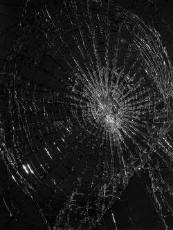
This is honestly kind of boring; shattered stuff can be cool, but this is really lacking any sort of context, and it is just dark on light. I'm not given any hint of what this is supposed to represent, and I'm not sure what would be shattered like this on a black background. If it was on some surface, or had some greater context around it, it might feel more meaningful.
Not much to add to what >>TitaniumDragon said.
It is very simple and suffer lack of context. The only context I could guess, it's that a broken phone screen. With that in mind, it add more depth to it, with the main tool for being connected with people broken. It's indeed a long way down to loneliness.
It is very simple and suffer lack of context. The only context I could guess, it's that a broken phone screen. With that in mind, it add more depth to it, with the main tool for being connected with people broken. It's indeed a long way down to loneliness.
This looks like a simple picture of broken glass. It needs more of either meaning or beauty.
Um ... I really hate to bring this up, but I do have some concerns here.
This piece appears to be a light photomanipulation of the fourth image of Alyson Shotz' "Sledgehammer/Glass/Light". IF this is being entered as art in and of itself, it either breaks the your-own-work rule or "must be done during the submission period" rule. However, just last art round we had an entry that was a vectoring of a screenshot, and the actual work involved was NOT at all obvious from the presentation. So I think it's important that I (and we) assume good faith here.
At that point my problem is, if it's being entered as a photomanipulation ... while photomanipulation in and of itself I believe is a legitimate art form, the similarity is pretty remarkable, at least at the level of detail that I can make out on my monitor. It looks like the midtones were just darkened to heighten the contrast/evoke the black background of a powered-off device, and I don't know that that single change rises to the level of artistic effort that I can judge. And if there's something else going on here -- such as vectoring -- it is invisible to me.
As such, I cannot vote on this piece without clarification from the author as to the intended media of the piece, or unless someone else points out further subtle manipulation that I'm overlooking. Frankly, a "Media" box may be a good idea to prevent this sort of misunderstanding with future submissions? :\
>>RogerDodger, can you contact the artist and review the nature of the entry?
This is nothing but a small, unclear photo of some broken glass. It's not very pleasant aesthetically to look at, nor does it look very intriguing or inspiring.
