Hey! It looks like you're new here. You might want to check out the introduction.
Show rules for this event
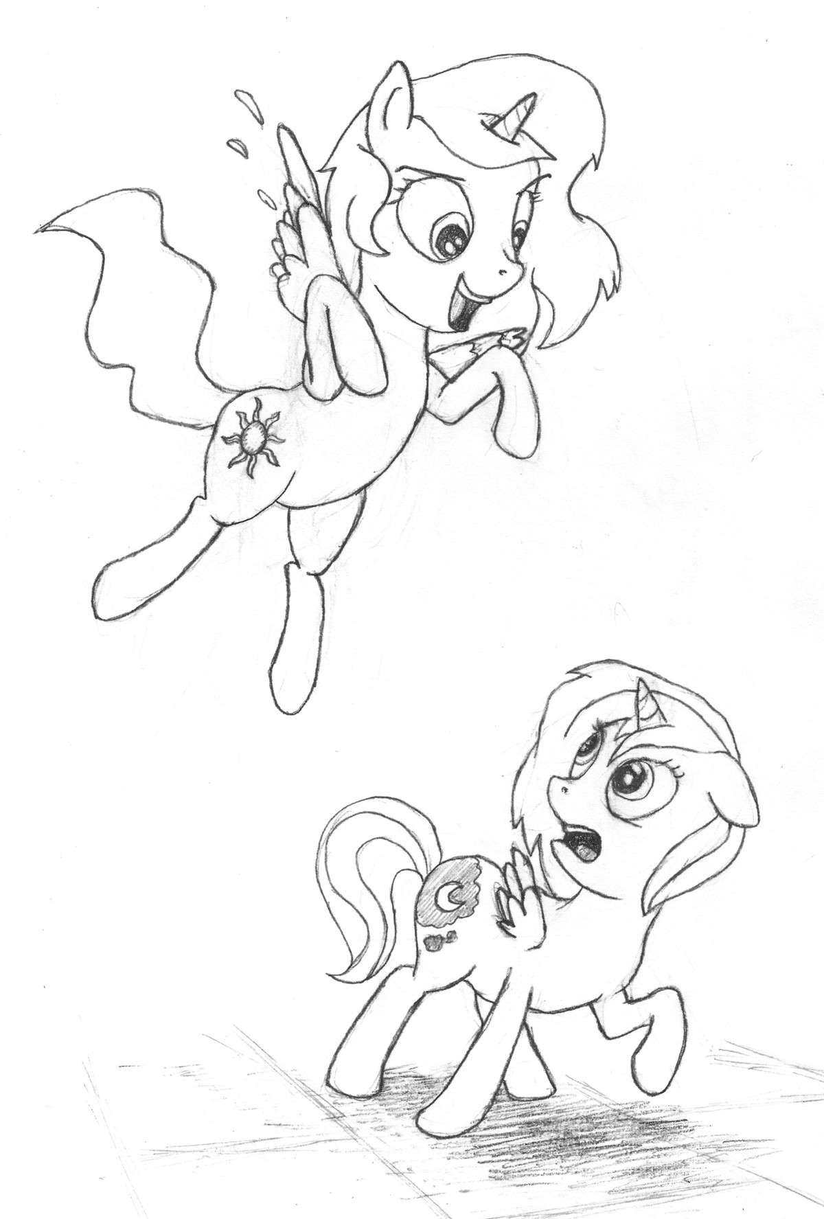

A cute and fluff piece. I quite like the feeling of motion we have here. Celestia's pose and expression are great. Her mischief is clearly visible in her eyes and in her smile.
As nitpicks, there are some problems with Luna (or Woona if you are cancer :p). Her wing feels a bit out of place, the left side of her mane is a bit weird and here right front hoof has a weird angle.
However, your drawing matches pretty well the way ponies are drawn in the show. A solid piece, without a doubt.

Luna looks... old. With that the wrinkle under the eye (I've read somewhere that every extra line on the face adds ten years or so to the character's age), and the oddly frazzled left side of her mane, I just can't get over the impression that she's an elderly lady. That, or she's just risen out of bed after a sleepless night.
Beyond that nitpick, though, I think this is a fairly cute drawing, although Celly's definitely drawn better than her sister.
Beyond that nitpick, though, I think this is a fairly cute drawing, although Celly's definitely drawn better than her sister.

D’awww. This is a bit rough (as mentioned, Luna’s face in particular needs some attention), but it nicely captures a fun moment.

This gets top points for cuteness.
Both ponies look just a bit off to me. It might be that the proportions aren't quite right, but I'm not sure.
Both ponies look just a bit off to me. It might be that the proportions aren't quite right, but I'm not sure.

>>Fenton >>JudgeDeadd >>The_Letter_J
I've been gnawing on the "looks off" question and I think it does come down to proportions. If you look at show fillies (e.g. google Sweetie Belle), the head is about as big as the body, which is the case here. But filly torsos are less elongated, and their legs are fatter (the torso is about four leg-widths long, and 2.5 leg-widths high). So the figures here feel like they have filly heads on adult bodies.
I like the prompt interpretation here, and some of the subtle detail (e.g. communicating emotion through the ear positions). The little bit of background we get, the 3-d floor, is a much better choice than a lazy horizon line, giving us depth and shadow. The sketching has obviously been cleaned up and the lines solidified. This isn't a hugely ambitious piece, but it meets its goals.