Hey! It looks like you're new here. You might want to check out the introduction.
Show rules for this event

The character is rendered in a ‘toonier style than the pit. Had the artist shown the pit illuminating the character, that would have helped the atmosphere of the piece. These issues aside, this is direct and effective, and the detailing of the pit is well executed. I like it overall.
This is a really neat photo. Very appropriate, and I like the clothes and the spilled booze in the bottom corner.

What's with all these entries trying to be what they aren't?
You probably didn't take much time to do this so I won't bother to waste my time on the review.
Next please.
You probably didn't take much time to do this so I won't bother to waste my time on the review.
Next please.
Not much to add to what >>TitaniumDragon said.
It is very simple and suffer lack of context. The only context I could guess, it's that a broken phone screen. With that in mind, it add more depth to it, with the main tool for being connected with people broken. It's indeed a long way down to loneliness.
It is very simple and suffer lack of context. The only context I could guess, it's that a broken phone screen. With that in mind, it add more depth to it, with the main tool for being connected with people broken. It's indeed a long way down to loneliness.
The colours are indeed pretty pretty. I'm a bit disappointed that, with such a title, the movement of falling isn't visible. The angle you chose is very interesting and great but doesn't really connect with the 'falling'.
A solid piece nonetheless.
A solid piece nonetheless.
I suppose it was meant to be funny but it fell flat for me, I'm sorry but that will be a no. Moreover, I don't want to search for the clues you gave in the titles' tabs.
I like this one. I agree with TD that it could use better contrast between foreground and background.
It isn't dark enough, I still can distinguish some of your drawing.
Did it end like that because you lack time to contrast it? If so, that's too bad. As it is, it's hard to properly grasp the whole piece and thus, properly form a judgement.
I don't know if I'll abstain for this one or not.
Did it end like that because you lack time to contrast it? If so, that's too bad. As it is, it's hard to properly grasp the whole piece and thus, properly form a judgement.
I don't know if I'll abstain for this one or not.
A man doing the robot dance while falling. I don't know what does it say about our world but it's still funny.

You’re still using Windows XP? Automatic fail.
I’m sorry you didn’t get the prompt you wanted. The screenshot with tabs and edited prompts is mildly amusing, but since I also grade for artistic effort, this won’t be going far up my slate.
I’m sorry you didn’t get the prompt you wanted. The screenshot with tabs and edited prompts is mildly amusing, but since I also grade for artistic effort, this won’t be going far up my slate.
J'ai dans l'idée qu'un certaine valorisation de son propre travail passe par la réinterprétation de son moi corporel, au sein même d'un cheminement expérimental, transcendantal et méditatif. Si l'élévation de son esprit passe par une introspection systématique et systémique de chacun de nos choix, alors l’irréel clarté de nos pensées iconoclastes et désoxydées nous apparaîtrait plus clairement.
(Text is from a French speaker, but feel free to improvise with the review - no one speaks French anyway)
This is a good idea, fitting nicely into the prompt. My problem is how much text there is. You can tell us to dismiss it but it still grabs the eye and I just can't forget it.
I'll disagree here. A representation of reality doesn't need to be accurate (I immediately understood that it was blood and I think it's clear enough here). In fact, any depiction of reality isn't reality. See this:
http://imagesanalyses.univ-paris1.fr/v4/wp-content/uploads/magritte_ceci_n_est_pas_une_pipe.jpg
(Text is from a French speaker, but feel free to improvise with the review - no one speaks French anyway)
This is a good idea, fitting nicely into the prompt. My problem is how much text there is. You can tell us to dismiss it but it still grabs the eye and I just can't forget it.
I think it gets a little too light in color; blood is pretty dark
I'll disagree here. A representation of reality doesn't need to be accurate (I immediately understood that it was blood and I think it's clear enough here). In fact, any depiction of reality isn't reality. See this:
http://imagesanalyses.univ-paris1.fr/v4/wp-content/uploads/magritte_ceci_n_est_pas_une_pipe.jpg
This looks like a simple picture of broken glass. It needs more of either meaning or beauty.
The concept and composition are good, but the sketch is very rough. Artist, I’d like to see you putting more time into the execution.
Pretty, but my first impression was actually of a spectacular sunset over shadowed mountains.
>>Fenton
Wow, please take a step back and cool off. I think that tone is really uncalled for.
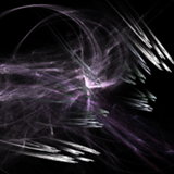
As for the picture, maybe it's a descent into chaos? I can certainly see a progression from bilateral, round shapes (biological), to multi-symmetric with straight lines (maybe mechanical?), to very abstract (maybe digital?). I don't get the last 3 frames, though.
Wow, please take a step back and cool off. I think that tone is really uncalled for.
As for the picture, maybe it's a descent into chaos? I can certainly see a progression from bilateral, round shapes (biological), to multi-symmetric with straight lines (maybe mechanical?), to very abstract (maybe digital?). I don't get the last 3 frames, though.

>>RogerDodger
Yeah but although the first 3 frames share nothing but the colors, the last 3 all share similarities with the 3rd. That's an odd break IMO.
Yeah but although the first 3 frames share nothing but the colors, the last 3 all share similarities with the 3rd. That's an odd break IMO.
I'd say it was a diving bell or sphere, but there's no air hose attached, so it may be more sinister...
This is a bit rough in execution but the values and composition are good. I like it.
This is a bit rough in execution but the values and composition are good. I like it.
>>wYvern
You're right.
Sorry author, I have been a bit frustrated by something which has nothing to do with this round and I vent out my anger on you. I apologise and now that I cooled down, I'll try to do a real review as an apology for my poor behaviour.
So this is a very abstract piece. It seems that you aimed for a deconstruction of something, which I still need to figure out, but I guess it is also what you aimed for by not giving much of a context aside from the title and the subtext.
However, there are questions left open, questions that doesn't fall into any interpretation.
Why curved lines disappear in the second part to reappear in the next panels?
Why did you add a darker blue on the second panel and a darker grey on the fifth? IMO, you should have gone with the same colors throughout all your entry.
As for the ranking, I'm not really fond of abstract art. Maybe other people will be pleased to see it, but for me, it isn't really appealing.
>>TitaniumDragon
Actually, the representation is very, very accurate. Blood is about this color when it's fresh from an aterial wound, since there's oxidized heme in the blood. You can't compare it to the stuff they take from your arm for blood testing, because that's from veins and has reduced heme. Even non-aterial blood will turn this color if it's exposed to air for a while, because the heme in it will take up the oxygen as it would usually in the lungs.
The 'dark blood' is acutally one of the main immersion breakers for me in movies. Someone gets their throat slit, or shot, and out comes dark cherry juice... it always makes me laugh.
It turns dark when it coagulates, which is accurately represented here by the text gradually shifting from dark to bright red.
Edit: If you're curious, here's a nice comparison between aterial and venous blood color.
I also needed the link that >>Fenton mentions to understand this picture. It’s showing the run up that goeth before a fall.
There are many metrics by which one can judge art. With something as simple as a line graph, we mostly have to go by meaning, and this one’s meaning is only apparent (without further explanation) to those educated in finance/mathematics. So, as art, I consider this mostly a bust. As a prompt idea, it is workable. I’ll put this down as mid-tier.
There are many metrics by which one can judge art. With something as simple as a line graph, we mostly have to go by meaning, and this one’s meaning is only apparent (without further explanation) to those educated in finance/mathematics. So, as art, I consider this mostly a bust. As a prompt idea, it is workable. I’ll put this down as mid-tier.
So I am viewing these on mobile, and I usually keep my phone on the lowest brightness to save battery. When I first looked at this image, I literally only saw a black square. I thought it was a joke until TD posted about seeing a corpse in the image. Even at max brightness I don't see the corpse very well at all. I understand the idea of utilizing darkness in the image to relay the feeling of the deep ocean, but you also gotta make sure your viewers can see your piece.
Oh damn, absolutely excellent composition on this. The bell doesn't read quite as well as it could have, it's just a tad too dark. The chain, I'm guessing you might've been going for motion blur (or not) that looks just a wee bit off.
Other than that, top tier.
Other than that, top tier.
Can't say anything other than this is the perfect embodiment of the feeling of space, and it fits the prompt oh-so wonderfully as well!
Should one be up in the clouds on a first flight?
I didn’t see that the figure on the left had an arm at first. The contrast can be improved here. I think the piece overall could use more definition and clarity in the rendering. The eyebrows in particular look cartoony in comparison to the rest of the piece. The anatomy of the figures needs some attention (compare the claw legs of the figure on the left, for instance).
On the plus side, Artist, you’ve presented a charming otherworldly scene and it looks as if you rendered it in traditional media, an extra challenge under Writeoff constraints. I like this piece and consider it to be a strong entry for this round.
>>Fenton
>>TitaniumDragon
I’m with them. I do believe I can detect where you started realizing you’d be out of room. :)
>>TitaniumDragon
I’m with them. I do believe I can detect where you started realizing you’d be out of room. :)
A basic doodle of a basic concept. It may result in a story, so it has that going for it.
As children, me and my siblings used to play this game where we'd collect mirrors from around the house, and then hold them in front of us facing up, and then walk around looking into them and pretending we were walking on the ceiling.
Um ... I really hate to bring this up, but I do have some concerns here.
This piece appears to be a light photomanipulation of the fourth image of Alyson Shotz' "Sledgehammer/Glass/Light". IF this is being entered as art in and of itself, it either breaks the your-own-work rule or "must be done during the submission period" rule. However, just last art round we had an entry that was a vectoring of a screenshot, and the actual work involved was NOT at all obvious from the presentation. So I think it's important that I (and we) assume good faith here.
At that point my problem is, if it's being entered as a photomanipulation ... while photomanipulation in and of itself I believe is a legitimate art form, the similarity is pretty remarkable, at least at the level of detail that I can make out on my monitor. It looks like the midtones were just darkened to heighten the contrast/evoke the black background of a powered-off device, and I don't know that that single change rises to the level of artistic effort that I can judge. And if there's something else going on here -- such as vectoring -- it is invisible to me.
As such, I cannot vote on this piece without clarification from the author as to the intended media of the piece, or unless someone else points out further subtle manipulation that I'm overlooking. Frankly, a "Media" box may be a good idea to prevent this sort of misunderstanding with future submissions? :\
>>RogerDodger, can you contact the artist and review the nature of the entry?
>>TitaniumDragon I think that's an oxygen tank, since the thing just by his head looks like the mouthpiece.
Also, the alt-text is a Shakespeare riff.
Also, the alt-text is a Shakespeare riff.
I wish the hair here looked hairier. I see a column of flesh extending upwards, and it's weirding me out.
The nudibranchs will welcome you.
I think your bubbles should be a bit more wobbly, because as-is, they don't look like they're bubbling very much. But I love the motion-blur on the chain.
I think your bubbles should be a bit more wobbly, because as-is, they don't look like they're bubbling very much. But I love the motion-blur on the chain.
I want to like this one more than I do, but the persons pose keeps throwing me off. It looks like they're either jumping impossibly high, or defying physics in some manner, or... I dunno. Something odd.
The rest is so well done, though... Especially the inclusion of the coiled bulb! That's a wonderful visual marker that tips attention in the right direction without being blatant. Excellent design.
The rest is so well done, though... Especially the inclusion of the coiled bulb! That's a wonderful visual marker that tips attention in the right direction without being blatant. Excellent design.
So I actually have an interpretation for this one, but I'm not going to say it because I'm curious if anyone else will come up with something and if the artist will reveal their intent.
I'm a bit iffy on something this abstract, because it tends to lean very heavily on viewer interpretation. It bugs me somewhat less in visual art, I think, possibly because I consume it so much faster; if I end up feeling my time is wasted in a choose-your-own-meaning story, I've sunk several minutes into it, whereas with visual art, I can glance, decide if I like it, and turn away if I don't find anything worthwhile.
That being said, this shows a clear progression, and I do appreciate that. Although I don't think what that it signifies is signposted strongly enough for good symbolism, it's clear the artist is trying to convey meaning, and that's great.
TD and Fenton up there said it pretty well... screenshotty and writing. Sure, it provides a momentary laugh, but nothing substantial.
This is easily my favorite so far. The colors are aesthetically pleasing, and it looks darn cool.
Without that link that >>Fenton put in, this looks more like "Going Up" than "It's a Long Way Down." I am very glad I read the comments before judging it, so, you know, thanks, Fenton.
This one just doesn't work with me. The human is wrong proportionally, and look too crayon-drawn.
This is one of my top favorites due to, well, everything. My only problem is how much text there is and how I can't read any of it.
Crashing airplane? The only things I can think of to make this better is something at the bottom, and either a clearer or more ambiguous airplane.
Dark. Both in the idea, and the picture. This one could really do with higher contrast, I had to go to near full brightness just to figure out there was a corpse.
Gonna start reviewing art because WHO NEEDS WRITING TIME ANYHOW
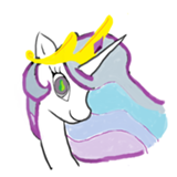
Joining the chorus that the art and memeage are kind of at cross purposes here — like cracking jokes in your feels-wrenching character drama. I'd honestly have liked this better with just the cartoon (blunt and all). Sorry, artist, but it's probably gonna end up a long way down my slate (and I half-wonder if that wasn't the prompt interpretation you were going for).
Compositionally, the memes make it too chaotic and unbalanced (though the "deal with it" sunglasses actually kinda work). The underlying cartoon is evocative; I like especially the aesthetics of the variance in line widths. There are some early signs of the "eh, f*ck it" meme aesthetic in the crown/hand holding the fan, so this may just be a victim of time/enthusiasm running out?
I, too, am a fan of the compact fluorescent bulb. The general aesthetic of the piece is nice. The sunset/sunrise/stars are evocative and it gets a lot across with the few details in its silhouettes.
The woman in the lead doesn't look to me like she's falling, which throws me perhaps more than it should. And I don't think the ... clouds? ... at the top work for me. But the piece is compositionally well-balanced and draws the eye to the right places.
The woman in the lead doesn't look to me like she's falling, which throws me perhaps more than it should. And I don't think the ... clouds? ... at the top work for me. But the piece is compositionally well-balanced and draws the eye to the right places.
I suspect this was drawn black-on-white (unless someone's a fan of scratch art), and I think inverting the colors was an excellent choice. It really evokes the lighting coming from the pit in an otherwise hard-to-replicate way. Part of me wants more of a background, and part insists that the lack of background is perfect for the "guy in darkness staring at a lit hole" effect.
This is cartoony but cleanly done on the whole; it feels a little like nitpicking to note that the three different steam clouds are all rendered in different ways, but that's a distraction as I try to really focus on the composition as a whole. Equally nitpicky, kudos for the five-fingered hands (though you're probably discovering why many cartoonists do them as four).
This is cartoony but cleanly done on the whole; it feels a little like nitpicking to note that the three different steam clouds are all rendered in different ways, but that's a distraction as I try to really focus on the composition as a whole. Equally nitpicky, kudos for the five-fingered hands (though you're probably discovering why many cartoonists do them as four).
>>MLPmatthewl419
The individuals in the picture had high expectations placed on them early in their life, and there is a heavy implication that they failed to "succeed" — thus having the most humiliating failure out of everyone in their class. They had the farthest to fall.
This gets across its tale of the prompt effectively (to me, at least), but I don't know how much there is to artistically evaluate. I definitely appreciate that it provided the additional context of the next entry down — in that way, it's something of a study in minimalism; it provided exactly enough information to communicate its context, which is a praiseworthy skill. But no yearbook I've ever seen used such a gaudy solid-color gradient (maybe I was lucky?), and I agree with >>TitaniumDragon that taking this pic more deliberately lo-fi to sell the "scanned page" aesthetic would have helped a great deal. Perhaps grayscale with a halftone dotting effect? Compositionally, the gradient is also sucking up so much of my attention that it's making it harder to get the point across.
I can’t even what.
Tier: Meta
‘o
/|\/”
/ \
^ (She’s either giving you a thumbs up or the finger. You guess which.)
Tier: Meta
‘o
/|\/”
/ \
^ (She’s either giving you a thumbs up or the finger. You guess which.)
Call me crazy, but it almost looks like the fourth panel can be read as the word "please" (the A is the purple-red-pink section).
I think I can see where this connects to the prompt (the "descent" into madness). I'm a little less excited about the execution. For one thing, I would switch the top two panels, because the "most" ordered to me feels like the one that is evocative of a Platonic solid. As previously noted, it also feels weird that entropy is increasing in the bottom four panels despite the core structure remaining much more similar than it does between the first three. I could read it as a sort of parable against weighing down a work with too many details, but the sudden context shift halfway through weakens that considerably.
Thank you for sharing though!
As meta as this is, the stick figures have a vast amount of character, the fic names are subtly smart, and in general the commentary hits home in the best satirical traditions. No useful critique. Well played, Swift.
Beautiful and mysterious. Even after taking it into a photo editor and brightening it, I’m not sure what they’re at the bottom of. A barrel? A bottle? A staircase? An enormous number 3, in which case perhaps they’re in the number mines of the Mathemagician?) There’s a suggestion of stalagmites in the distance, or perhaps golden towers?
There’s a lot here to inspire an author. Well done, Artist. Top tier.
There’s a lot here to inspire an author. Well done, Artist. Top tier.
Huh. How has this only accumulated one comment so far?
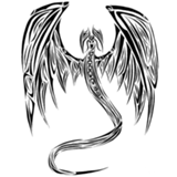
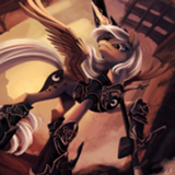
Agreed that the linework isn't contributing as much to your clarity as it could. Artist, you might want to consider doing lines in black and then making a separate layer underneath for coloring so that your edges remain crisp and bold. In some areas (the harpy's wings, the draconic (mechanical?) wings) the technique you're using looks good, but the harpy's wing/arm contrast is poor and the areas where widely different colors butt up against each other look a little mushy.
A lot of effort has gone into shading here, to mixed effect; great in (say) the right-hand guy's cheekbones, but the shading in (say) the harpy's face looks quite odd to me since it doesn't match the rest of the picture in suggesting the light comes from above the figures.
I love the way you bundled the guy on the right up for winter. (I keep wanting to call him a dragon, but I'm pretty sure that the wings are segmented and have pins holding the joints together.) I do wish that the composition had been such that you could have put the cloud elsewhere; losing the lower half of the right-hand figure feels like it throws the composition a little out of balance.
On balance, though, this is good non-verbal storytelling.
I feel like we're getting a lot of entries this round that are telling stories well through implication. It's almost like we set a bunch of authors loose with artistic media!
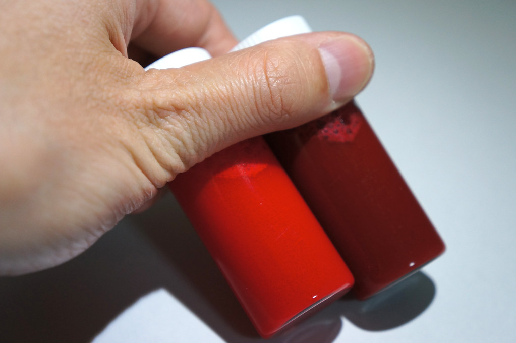
I'm going to have to think about how to score photography against traditional arts, but I like this an awful lot as a composition. The constrasting colors, the balance between the rocks in the lower left and upper right, even the way the spilled alcohol curves on its way to the rock edge. Whether or not it took a lot of work to get this shot, the way everything works together makes me feel like it did, which is to your credit. If I had to nitpick, I'd point out that the shoes and socks stand out strongly, but the ... shirt and jacket? Shirt and pants? ... are just sort of formless lumps, which aren't really pulling their implicative weight. Still, nice job.
[EDIT - Post-competition note to people linked here from outside: Since entries are posted anonymously and participants review each others' work, sometimes fake self-reviews are posted in order not to tip people off to which entry is yours through the fact that you're not commenting on it.]
I am wondering why this person seems to be smiling on the (I presume) way down.
As others stated, the landscape is passable but the human figure needs work.
As others stated, the landscape is passable but the human figure needs work.
Well, this one's a bit of an implication sledgehammer rather than an implication rapier. It's got what it needs to get its point across with that F-bomb punchline. Honestly, though, I feel like there's so much more context I want to see: what's got Tom so riled up that he can overreact so viciously?
And in a way, that feels like this piece's weakness. It leaves a lot unexplained around the edges (that writers can step up and try to fill in, but that this as a standalone art piece feels oddly empty without) ... but it's blocking in so much of the core story arc with that specific setup and the e-mail reply that I'm finding it hard to draw much inspiration from it. Though I note that the mouse pointer is merely hovering over send, which is a nice touch.
Artistically and compositionally ... what can I say? It's very effective in emulating the screenshot. It's, well, a screenshot. I can't really evaluate it aesthetically so much as judge the effort of its assembly and its effectiveness in communicating its ideas. ¯\_(ツ)_/¯
Thank you for sharing!
..........
That is all.
Actually, that's not all. You got some fun memories to surface in me from the 420 writeoff awhile ago. Congrats.
That is all.
Actually, that's not all. You got some fun memories to surface in me from the 420 writeoff awhile ago. Congrats.
Oh, wow. The style absolutely pops off the page with this one. The linework and exaggeratedly willowy shape of the character reminds me very strongly of a particular artist I can't name but have seen in high society cartoons (New Yorker?). The shading is subtle and laser-targeted to where it does the most good; the light blue wash around the stars up top is especially nice. The movie-poster formatting is super on-point, the typography is bloody fantastic for hand-drawn, and the Simlish letters are great.
I'll echo the criticism about the hair (the pink-to-white fade is deeply odd — the only shading decision I question). Also, compositionally, I think you want more white space between the figure and the text, splitting the page into two even vertical columns; you have a lot of dead space on the left right now. Regardless, this is an easy top tier for me, both in terms of prompt inspiration/interpretation and artistic merit.
I'll echo the criticism about the hair (the pink-to-white fade is deeply odd — the only shading decision I question). Also, compositionally, I think you want more white space between the figure and the text, splitting the page into two even vertical columns; you have a lot of dead space on the left right now. Regardless, this is an easy top tier for me, both in terms of prompt inspiration/interpretation and artistic merit.
Again, artist, my apologies: Artistically and compositionally ... what can I say? With low-res two stick figures and a bent line, I can't really evaluate it aesthetically so much as judge the effort of its assembly and its effectiveness in communicating its ideas. (It does so. Points for minimalism?)
I think this needs to be a little higher-res to succeed even at its modest goals, honestly. The figure at the top of the cliff is something of a blob. It took me reading the caption plus too much effort to realize that (the person who is presumably) Dave is standing in a Sparta-kick pose with foot outstretched.
Regardless, thank you for sharing!
I think the biggest problem with the human figure is that it's got something of a Lego head: large relative to body, no neck, shoulders up at jaw level.
The curvature of the motion lines implies the figure is being thrown rather than simply falling. I might be reading too much into that, but if that was your intention, artist, then kudos on a nice bit of storytelling by implication.
Effective framing, and as others have said, everything but the figure feels aesthetically fine. Thank you for sharing.
I think the title (a riff on mobsters' threats of enemy disposal) makes pretty clear the intention here: being dragged into the depths by a weight manacled on.
There's way too much slack in the chain if that's the case, but I'm willing to forgive that as artistic license given that the composition framed by the chain is super strong and easily the best part about this. Likewise, the fact that these mobsters are throwing their victims into the Mariana Trench is something I'm willing to spot it on the grounds that it gives the picture a sense of depth that a simple background of murky water wouldn't (and seeing the entire ocean floor would clutter). Nice work with the bubbles, too. Not in my top tier but solid overall.
There's way too much slack in the chain if that's the case, but I'm willing to forgive that as artistic license given that the composition framed by the chain is super strong and easily the best part about this. Likewise, the fact that these mobsters are throwing their victims into the Mariana Trench is something I'm willing to spot it on the grounds that it gives the picture a sense of depth that a simple background of murky water wouldn't (and seeing the entire ocean floor would clutter). Nice work with the bubbles, too. Not in my top tier but solid overall.
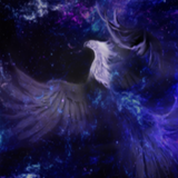
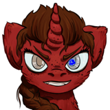
I'm kinda confused by the perspective here. This is looking past the elbow of an outstreched limb with viewpoint-"up" opposite body-up; it's clearly not the perspective of the individual who owns the limb (try it yourself). But if that's implying a second character of the viewer, that's disrupting all my interpretations; and if we're getting a disembodied third person view I'm struggling to understand what the significance is of this particular angle-slash-focus. Not to mention the blank I'm drawing on prompt interpretation, especially since I keep wanting to read toward-the-stars as up rather than down.
That said, this is gorgeous, especially the feathers. Agreed that it could be higher-contrast; I think you could do that while sticking to your red-heavy color scheme, just make it a contrast of brightness rather than tone. I think that would also improve your composition by giving you something of a yin-yang effect that right now is only weakly hinted. As it is, you've got this sort of circular pattern in the stellar nebulae and a sort of stripeyspotty thing going on with the feather highlights, and the lack of tonal/color contrast means that the pattern contrast dominates, and that feels clashy (as pattern-contrast does).
That said, this is still gorgeous, and on that alone it's going to rise fairly far in my slate.
Frankly, it's the little details that make this. (lol 420 pm lol) The main window, which looks like the punchline, is just eye-roll-worthy at first glance, but digging into the context turns it funny. That said, I feel like with the surrounding tabs and programs, this would have been stronger if Twincest had been the only upthumbed vote.
In my voting, this will go above the other screenshot entry I reviewed (>>horizon) on the basis of all the little details being more rewarding to explore — though I don't know that it will rise significantly farther, and for similar reasons. Regardless, thank you for sharing.
In my voting, this will go above the other screenshot entry I reviewed (>>horizon) on the basis of all the little details being more rewarding to explore — though I don't know that it will rise significantly farther, and for similar reasons. Regardless, thank you for sharing.
Rushing through the rest of my slate so I can finish voting and get to writing, but this one's only got a single two-sentence comment so far. :| I wish the art gallery showed comment numbers.
I was just about to half-heartedly rank this "best of the doodles" mid-slate when the full twist of the prompt interpretation hit me and I laughed. Well played, artist. The XKCD-style caption provides a bonus grin, too. And while the art style here is a little cruder than some entries (the bouquet (?) in particular looks like a dead Muppet), the facial expression on the grave-robber is great, which is important because it's a pivotal focal point.
Another not-top-tier-but-solid entry -- I encourage you to clean up some of your lines and turn in something a little more polished than scribbly, and this'll have a shot at the top.

This is essentially just a random picture of two people. It has no concept to speak of, isn't even aesthetically pleasing, and there is no obvious connection to the prompt.
This is nothing but a small, unclear photo of some broken glass. It's not very pleasant aesthetically to look at, nor does it look very intriguing or inspiring.
I'll agree with everybody else that the weird entropic shift in the middle throws me off a bit. On top of that though, something that really messes with any interpretation of this that I could have is that the second panel is unquestionably a d20. Combined with the fact that the first panel appears to be forming a human portrait, this sets up a very specific expectation in my mind as to where this is going to go... and then it turns into a full abstraction.
This could be signifying the point where viewer interpretation kicks in, but honestly, the point of abstract art is generally that the whole thing is up to any interpretation. Here, with defined shapes suddenly shifting to abstractions, we get an odd mix that neither lets the viewer have a completely subjective experience nor gives them a solid idea of what's going on. Personally, I think you should've either stuck with the theme of your first two panels, or only included the last three.
Aside from that though, this piece is really well made. The lines are crisp and the colors pop. I just wish it was a bit more consistently abstract.

>>JudgeDeadd
I don't normally do this, but the prompt connection here is actually hella obvious.
Voted most likely to succeed in graduating high school. That's a pretty easy pedestal to come crashing down from.
I don't normally do this, but the prompt connection here is actually hella obvious.
Voted most likely to succeed in graduating high school. That's a pretty easy pedestal to come crashing down from.
The top panel does seem to include a human head form, with what I take to be an intrusion from some other source. (I am put in mind of this comic panel (top left) which represents Dr. Strange entering and reading the mind of an alien invader.) I disagree that the second panel is necessarily a D20; it seems to be mostly the result of straightening the lines in the first form. With the title and caption, it’s reasonable to take the colors as potential emotions, ideas and ways of life which are first regimented by societal pressures, then straightjacketed, sequestered and reduced so that what was once unthinkable and horrid now becomes the only possible and sensible choice.
Whether I’ve gotten your full intent or not, Artist, you made me think about it, for which I thank you. Your work is technically solid and well composed. I will rank this as an upper tier effort.
Whether I’ve gotten your full intent or not, Artist, you made me think about it, for which I thank you. Your work is technically solid and well composed. I will rank this as an upper tier effort.
>>horizon I interpret it as the feathered character being off visual top-left, descending toward visual bottom-left which is also physically-down, for what it's worth; I don't read the starry section as being physically-up at all. I don't think the perspective there has to have any particular significance except that it makes the angle obvious without being too detached, and results in the nice curve/separation between the two halves of the image (which I agree could be significantly improved with more lightness contrast).

Either my first or second favorite of the contest. There'll be some soul searching to do later, I suspect...
This one's great too. You really get a good sense of the gravity here. I did a photoshoot a few years ago with a similar concept—perspective is a lovely thing. :D
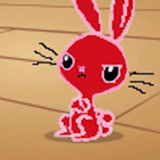
This one is nice—colors are "pleasing," and I like the possible mother/daughter or siblings relationship between the figures—but I'm afraid it's not hitting me with the same strength that it's hitting others. There just isn't much here that stands out. Also, misuse of hyphen in the title = me sending an angry badger to your mailbox.
I see both the golden ratio and a vagina. And someone being pulled to their death. And water. Is this a summation of life and the universe?
I appreciate the work that went into this, and I acknowledge that it's very well composed and crafted, but it doesn't excite me.
I appreciate the work that went into this, and I acknowledge that it's very well composed and crafted, but it doesn't excite me.
I hope these aren't real names... or else you might have a lawsuit coming your way, artist. :P
I'm surprised peeps are having trouble seeing the prompt here. As >>AndrewRogue noted, it was pretty obvious to me. In any case, this is garish as hell, but I sorta love it? I like the idea of trying to remake a yearbook. Not my favorite of the competition, but very interesting.
I'm surprised peeps are having trouble seeing the prompt here. As >>AndrewRogue noted, it was pretty obvious to me. In any case, this is garish as hell, but I sorta love it? I like the idea of trying to remake a yearbook. Not my favorite of the competition, but very interesting.
What >>Ratlab said. I would never have seen this as a wing unless I read the comments, and even then I had trouble seeing it.
I'd forgotten all about:
This being the Writeoff weekend till Saturday afternoon. Then I made the mistake of looking at the gallery and got hit with a story idea. So now I've got, what, a day and a half to squeeze something together? Yeesh!
Mike
This being the Writeoff weekend till Saturday afternoon. Then I made the mistake of looking at the gallery and got hit with a story idea. So now I've got, what, a day and a half to squeeze something together? Yeesh!
Mike
I'm calling this for being a flight-simulator game screenshot rather than a render, for one specific reason: I don't think someone who hand-assembled it for a render would make the mistake of calling the Cyrillic lettering "Korean script". (Also, for as detailed as the dashboard is, the shadows are super bitmapped.)
I don't say that to slam this; what's important is the final product. And while I'm not terribly familiar with aviation I can definitely see the narrative here. The top center dial is aircraft pitch and angle; while the plane is basically side-to-side level it's in a severely steep descent (the center numbers are degrees from level; 0 means flying parallel to the ground, and 90 means straight down). I also see what looks like an altimeter in the lower left, telling us that the plane is 4100 ... meters? ... high, a long way down indeed.
As for the rest, I'm afraid my lack of knowledge is causing me to struggle. I think the upper left dial is a speedometer?, but if that's the case the plane seems to be flying well below stall speed, at 20 mph/kph/knots/whatever. That also makes the dive perplexing, because if you're headed at a 70-degree angle downward you ... aren't exactly gonna be dawdling. The far right "100%" thing might be fuel gauges?, but other than that I have no idea what the rest of the dials represent. That kiiiinda works in the sense of illustrating the chaos of a tense flight situation, but it also throws in a lot of red herrings preventing the viewer from understanding the meaning of the piece, adds compositional clutter, and (at least for me) dilutes the core narrative presented by the "important" dials I interpreted, making me feel like there's more to the story I don't understand.
Could that have been fixed by using dials with English instead of foreign lettering? Partially, but then that adds even further to the information overload, so all of those dials had better be relevant if you switch, or you're going to need to find some way of drawing the eye to the important ones.
(It's a shame that the pitch indicator doesn't have the negative angles on a red background or some such; a splash of color would have really made it focally central. Instead, it's half obscured by the shadow of the control stick, which reduces its importance.)
The tight focus on the dials is, on the whole, good composition, just hampered by the above issues. The stark blue and black and white I think adds an abstract coldness to the piece that serves it well, but, again, a splash of color on the most relevant dials would have been welcome. On the whole, I kind of want to like this more than I actually do; middle tier, but thank you for sharing.
Elegant minimalism. I very much appreciate how the shape of the canvas is what tells the story. I think I like the canvas shape's implied ground even more than if you had added an actual ground in, which is a strong positive given the piece's aesthetic.
If I had to nitpick, I'd note that while the plane looks iconic, with a stark and sharp black-and-white outline, the edges of its wings are rough and fuzzy (the more so since the rotor is put in inverse contrast). Since the plane is basically the piece's one visual element, it would help to have it fully crisp and clear and unambiguous at a glance.
Still, this succeeds at its modest goals, in spades. While I don't know that I can justify putting this in my top tier on the basis of that single gimmick, I'll find a spot for it somewhere with my solids.