Hey! It looks like you're new here. You might want to check out the introduction.
Show rules for this event
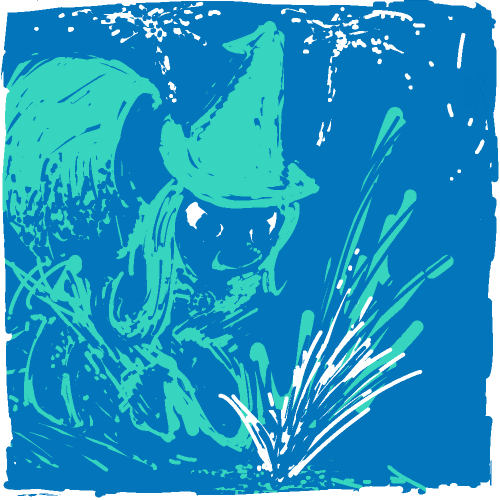
The style here is messy, but it's immediately obvious who the pony is from that cape and hat. The use of mostly blue on blue, with just the eyes and a few sparks in white is interesting, and gives good clues for directing attention while also giving me an impression of shadow and glow.
Neat. Pretty simplistic, I think, but nicely done.
Neat. Pretty simplistic, I think, but nicely done.
Definitely something I wasn't expecting with the announcement of art for this contest. You truly peaked my interest when I glanced at it, as you most certainly made out to be different from the rest of the crowd (minus one, Automating Friendship, which also stands out). I'd like to praise it more, but I must continue.
Simple, but pretty effective; my biggest problem with this is that the dark blue on light blue, while it works, might have been better with more contrast?
I'm not really sure.
That said, this ended up high for me, so take that with a grain of salt; this worked pretty well and is actually a pretty solid prompt piece.
I'm not really sure.
That said, this ended up high for me, so take that with a grain of salt; this worked pretty well and is actually a pretty solid prompt piece.
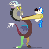
Even from what seems a scribbly mess, it is clear at a glance that this is Trixie, doing something with sparks, and excited/happy/malicious/all-of-the-above about it. While seeming to do everything wrong, this is among the more engaging pieces. Perhaps undeserving in the technical sense, this has landed itself at the top of my ballot. I am awed.

This achieves some nice effects with a limited color palette. It’s obvious that it’s Trixie, but her legs and mark are not well defined. It’s expressive but a bit sloppy for my tastes. I’m putting it in the middle ranks.
I'm pretty sure I know who drew this, but I don't think I'm biased when I say this is lovely. I'm a big fan of your contrasts here—white against blue is a combo that's always been eye-catching and eye-pleasing to me. And that's not even mentioning Trixie's great smirk, or the way in which the entire piece seems to be connected in one swath of color.
This is easily my favorite piece from the contest. The way it's both so playful and yet precise enough to clearly depict what it wants to really enthralls me. I reminds me of a picture of a mermaid in a similar style I saw as a child... I wish I knew the artist, but I think I never did.