Hey! It looks like you're new here. You might want to check out the introduction.
Show rules for this event
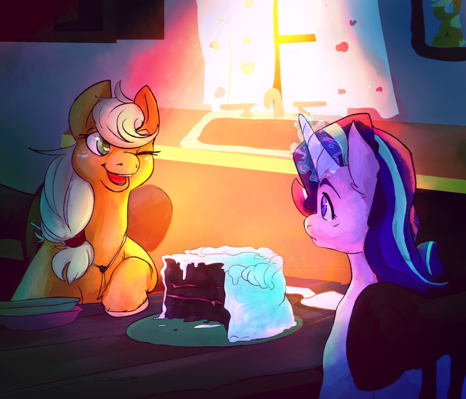

Applejack's facial proportions seem a little compacted, but the lighting effect and the focus on the light-and-dark half-cake are just too gorgeous, darling. Easily the best of the bunch for me.

Wow, I am really awed that you managed to put this together within the drawing period. Splendid goddamn work with the shades and colors. The sunlight feels warm, and Applejack feels even warmer. I'm also a fan of your pony-style—personally I love it when artists get just a little more horsey than the show's style. A very impressive piece no matter which way I slice it (pun intended!).
Starlight has a bit of a case of the "blob-body" going on, and Applejack's right side is also looking a little melt-y, and I think the perspective on the sink is tilted too high.
But those are really the only complaints I have about an otherwise pretty, pretty piece. The details in the manes and the cake and the faces—Good god damn, those faces; they're so warm and friendly—make everything come together. But the standout is the colours, I think, and the sort of almost-blotchy style that's been used to paint this. It's all these things that I've described that makes this piece stand out from all the other entries. Great work!
But those are really the only complaints I have about an otherwise pretty, pretty piece. The details in the manes and the cake and the faces—Good god damn, those faces; they're so warm and friendly—make everything come together. But the standout is the colours, I think, and the sort of almost-blotchy style that's been used to paint this. It's all these things that I've described that makes this piece stand out from all the other entries. Great work!

This is a well put together piece! The shot is framed well, there's cool contrasts, and the cake looks really well drawn.
I'm going to try to avoid restating what other people have already said.
Starlight's profile is well drawn and the colors of their coats are well rendered. There's like a blue reflected light that comes off of the cake that would suggest it's coming from Starlight. It just shows there's a good deal of atmospheric harmony. The fur on Applejack's hooves are a nice touch. The linework and brush shape you use is very painterly, which complements your style of blending.
One thing, (which might come off as a nitpick, but bare with me) is the sink isn't just a bit askew, but it's kinda misplaced. At least it seems so. Kitchen sink edges aren't normally flush with the edges of the counters they're built into. Also, the cabinets and most of the counter feels too straight. Like, the edges are too clean. It doesn't fit well with the painterly style, though it's pretty fine.The sunlight, which is rendered well, draws the eye from that information anyway. Preserving the opacity and adding light on the table's lines was a good touch, and it might have looked nice on the girls too.
This is a real good one. Very well done!

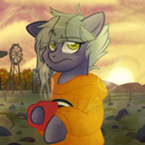
This is probably my third favorite art piece, though it's perhaps the most "complete" of all of them. It does a great job of bringing a scene to life, it's very lush, etc.
(Clearly I am not God's gift to art criticism)
(Clearly I am not God's gift to art criticism)

Woot. Great job, artist. Lovely expressions, clean lines, good contrast and coloring, and a cake I’d actually eat. You’ll get a medal for this.