Hey! It looks like you're new here. You might want to check out the introduction.
Show rules for this event

DUDE. Whoever did this... let's talk after. If you can do this with ponies... yeah. Let's talk.


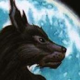
Creatures designed by Deviantart
God have mercy on our souls, this is the most terrifying horror movie ever made!
I like the idea, I like the execution and the overall picture, and the little details "hidden" in the credits are funny to read.
However, there is huge clash between the background and the island. One is a realistic representation (if not a photo) of an island, and the other is a dreamish 80s naive representation of a sunset (which is also the symbol for new retro wave music).It reminds me of these "photoshop masters". And with all the little jokes, I understand this was not supposed to be a realistic and serious movie poster, but with the clash, and because I'm a
Also, there is not enough boobs. 5/7

The eighties want their background returned. The memes drift by in lazy banners. This will be Gottfried’s finest effort since the Fifty Shades of Grey audiobook. Ten of nine shoops.

My longer retrospective is lost to the aether. Such is life, you'll have to make do with the abridged one.
I'm happy to have gotten a medal this round. I'll do my best to keep up the good work and improe in the future! My only regret (aside from not having time to make more art entries or even finish my story) was the lack of polish on the poster. >>Fenton brought up the issues with the island, and yes. It's just a normal island with some filters on it and slapped in the background because I had less than six hours before the deadline. Same goes for the embarrassing shading. Mea culpa and all that.
Nevertheless, I accomplished most of what I set out to do with this, and I'm proud of that much, at least. I really liked Variations of a Theme, the setting was interesting and I liked the feeling of isolation and dourness I got from reading it. So, of course I chose to do a movie poster depicting it as a low-budget, shlocky 80's action flick.
Also, I'm surprised nobody brought up how this blatantly rips o--I mean, how this is heavily inspired by the Buckaroo Banzai poster.
>>moonwhisper
>>MLPmatthewl419
>>GaPJaxie
I'm glad you all liked it. I'll do my best in future art rounds as well!
>>CoffeeMinion
Sure. Send me a PM in FiMFiction or discord if you like.
>>Fenton
I take full responsability on the dissonance between background elements. I was busy most of that week, and wasn't able to put as much effort as I wanted on it. If I'd had the time, I would've drawn the island from scratch, and make it look more mysterious. Live and learn, I suppose.
Of course there are not enough boobs. Jules is the MC, the eye-candy are the men. And the crab.
>>GroaningGreyAgony
Yeah, good luck with that.
I'll work hard to make it a full ten next time!
Thanks again to everyone who liked this, and thanks as well to those who didn't, but cared enough to give some feedback.
Cheers!
I'm happy to have gotten a medal this round. I'll do my best to keep up the good work and improe in the future! My only regret (aside from not having time to make more art entries or even finish my story) was the lack of polish on the poster. >>Fenton brought up the issues with the island, and yes. It's just a normal island with some filters on it and slapped in the background because I had less than six hours before the deadline. Same goes for the embarrassing shading. Mea culpa and all that.
Nevertheless, I accomplished most of what I set out to do with this, and I'm proud of that much, at least. I really liked Variations of a Theme, the setting was interesting and I liked the feeling of isolation and dourness I got from reading it. So, of course I chose to do a movie poster depicting it as a low-budget, shlocky 80's action flick.
Also, I'm surprised nobody brought up how this blatantly rips o--I mean, how this is heavily inspired by the Buckaroo Banzai poster.
>>moonwhisper
>>MLPmatthewl419
>>GaPJaxie
I'm glad you all liked it. I'll do my best in future art rounds as well!
>>CoffeeMinion
Sure. Send me a PM in FiMFiction or discord if you like.
>>Fenton
I take full responsability on the dissonance between background elements. I was busy most of that week, and wasn't able to put as much effort as I wanted on it. If I'd had the time, I would've drawn the island from scratch, and make it look more mysterious. Live and learn, I suppose.
there is not enough boobs
Of course there are not enough boobs. Jules is the MC, the eye-candy are the men. And the crab.
>>GroaningGreyAgony
The eighties want their background returned.
Yeah, good luck with that.
Ten of nine shoops.
I'll work hard to make it a full ten next time!
Thanks again to everyone who liked this, and thanks as well to those who didn't, but cared enough to give some feedback.
Cheers!